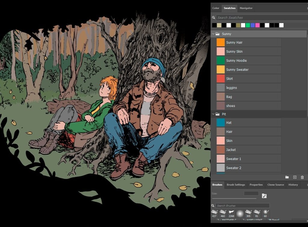
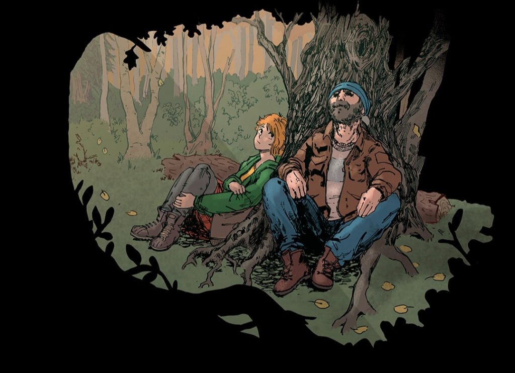
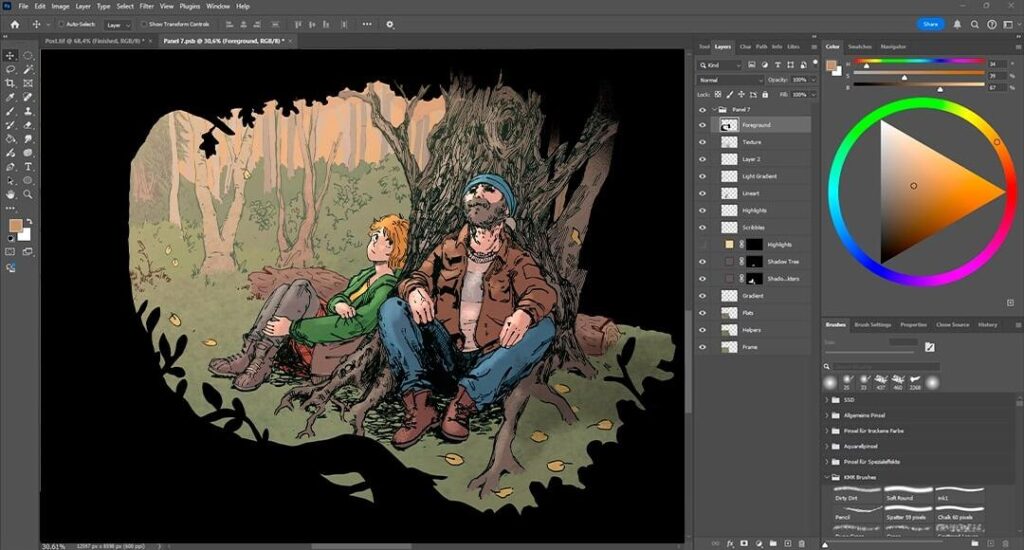
For Sunny Side Down, I will be coloring over 170 pages with an average of 7 panels each. Below, I describe the workflow that lets me finish the coloring in a timely manner. With so many pages to color, done is better than perfect! I prefer non-destructive painting — it gives me the freedom to adjust colors, shading, lighting, and to do detail work later on, without having to worry about losing the work I’ve done so far. So for every new step, I use a separate layer.
I use a Wacom Cintiq 16 painting tablet. While I work in Photoshop, you can find similar features in most other graphics editor programs.
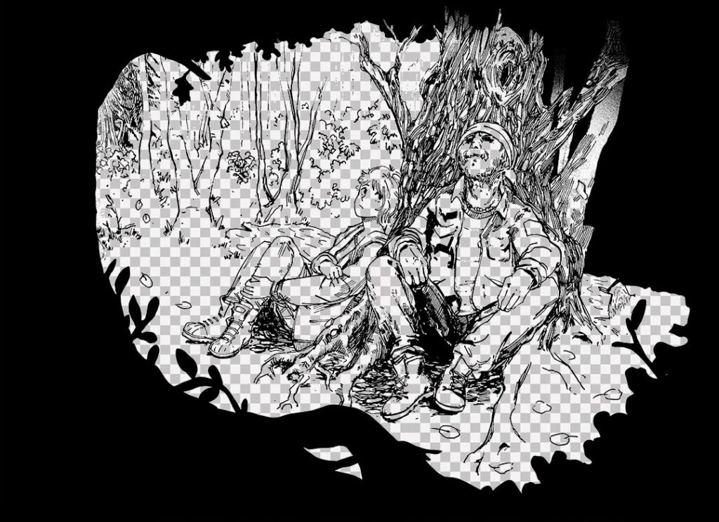
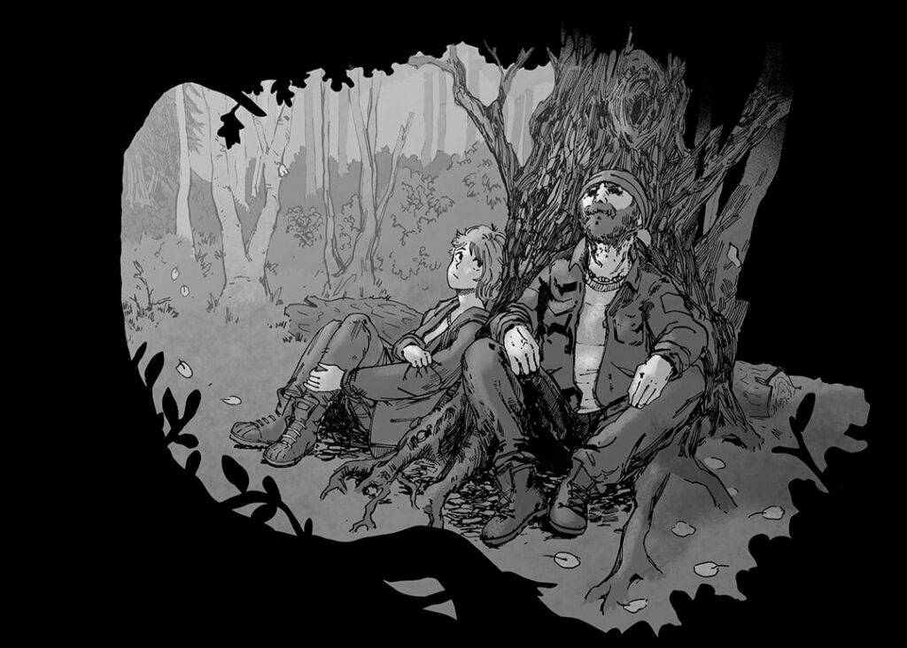
1. Preparing inks
I start with Amy’s scanned inks, which are in black and white. I select the white background and delete it, leaving the black line art on its own transparent layer, which will stay on top of most other layers.
Generally, I always set my selection tools to 0 tolerance and disable anti-aliasing. This way, I can select areas with pixel-perfect precision and don’t have to deal with annoying artefacts.
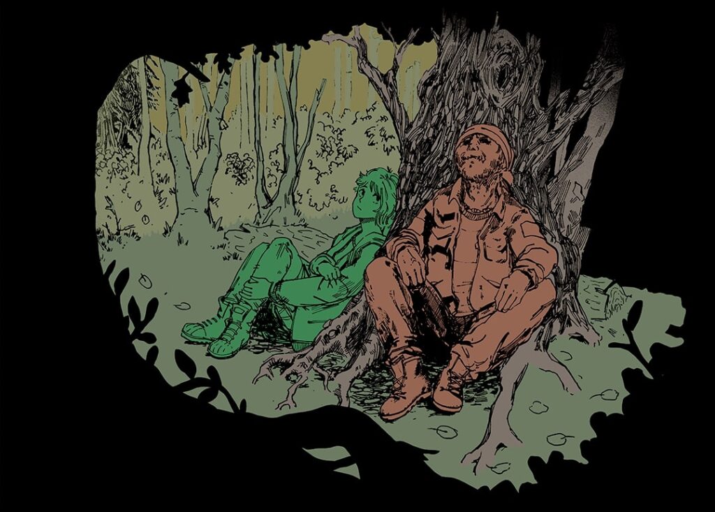
2. Blocking out areas
Next comes the Helper layer. I divide the panel into major zones (characters, background, etc.), which I fill in with the same color. This lets me use the Magic Wand Tool to easily select the specific object I would like to focus on, for example, Sunny’s silhouette, and to apply effects to it on another layer without touching the rest. The Helper layer won’t be visible in the final piece, but it’s essential during the coloring process.
To create this layer, I use the Lasso and the Paint Bucket tools, again with anti-aliasing turned off.
3. Creating flats
The Flats layer is the backbone of my coloring. It is created the same way as the Helper layer, using a copy of the Helper layer as a basis, but is much more detailed: now, every part of an object gets its own flat color. At this point, I don’t worry about tints that would be caused by light sources and conditions.
Colors I use frequently (like Sunny’s hair or Pit’s jacket) are saved as swatches.
4. Setting gradients
I slightly blend the colors of the background with a gradient. I use the Helper layer to select the areas, then I add gradients on a new layer, setting the blending mode to “Multiply” and lowering the opacity. Subtlety is key here!
These gradients will also already create a very simple shading.
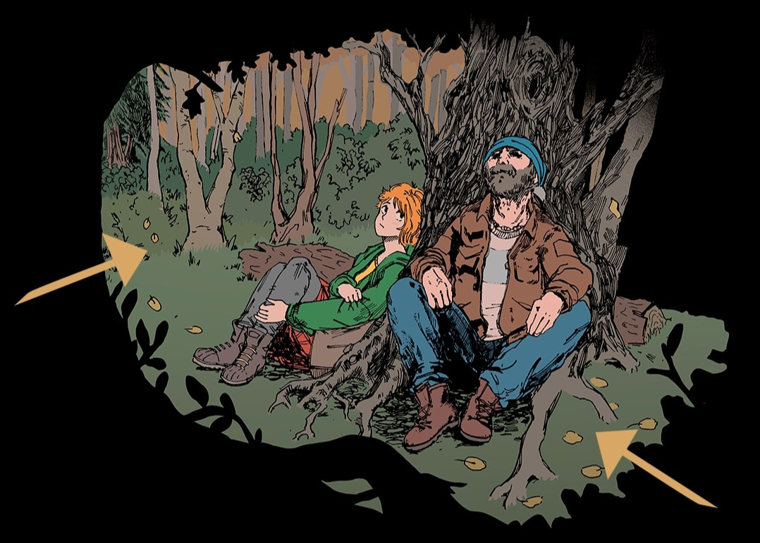
5. Painting shadows
Shadows make the most dramatic change to a panel. The eye gets drawn to the highest contrast points, so I mainly apply shadows to the characters and a few key elements.
I select the target shape via the Helper layer and create a “Solid Color” layer — usually in dark purple — which masks the shape. I set the blending mode to “Multiply” at around 40-60% opacity and, with a rough chalk brush, paint in the “light” (the spots that will not be affected by the shadows) into the mask.
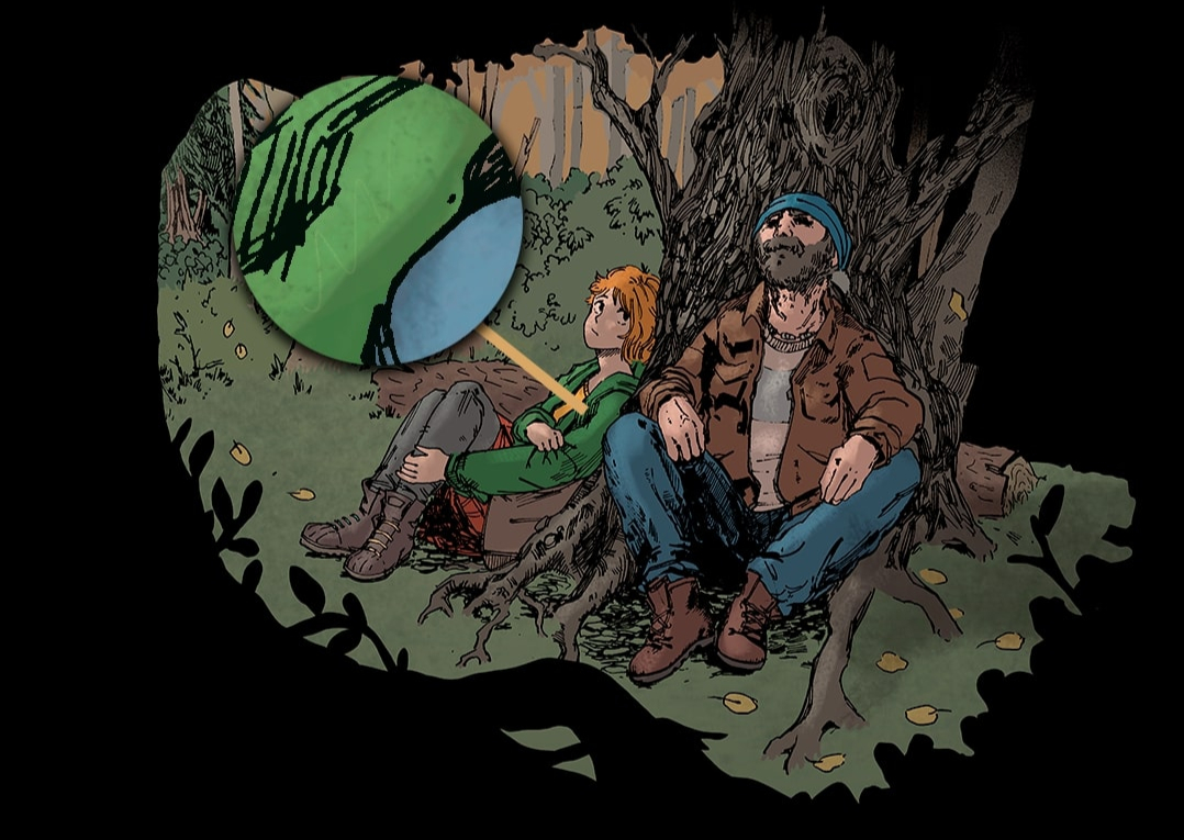
6. Adding highlights
I select the areas I would like to highlight with the Lasso tool and fill them in with a bright yellow color on a new layer set to “Screen” blending mode at 4% opacity.
7. Scribble details
I scribble faint pencil lines inside the highlights using a brush with a low “Flow”. It’s barely visible but adds a more hand-painted texture.
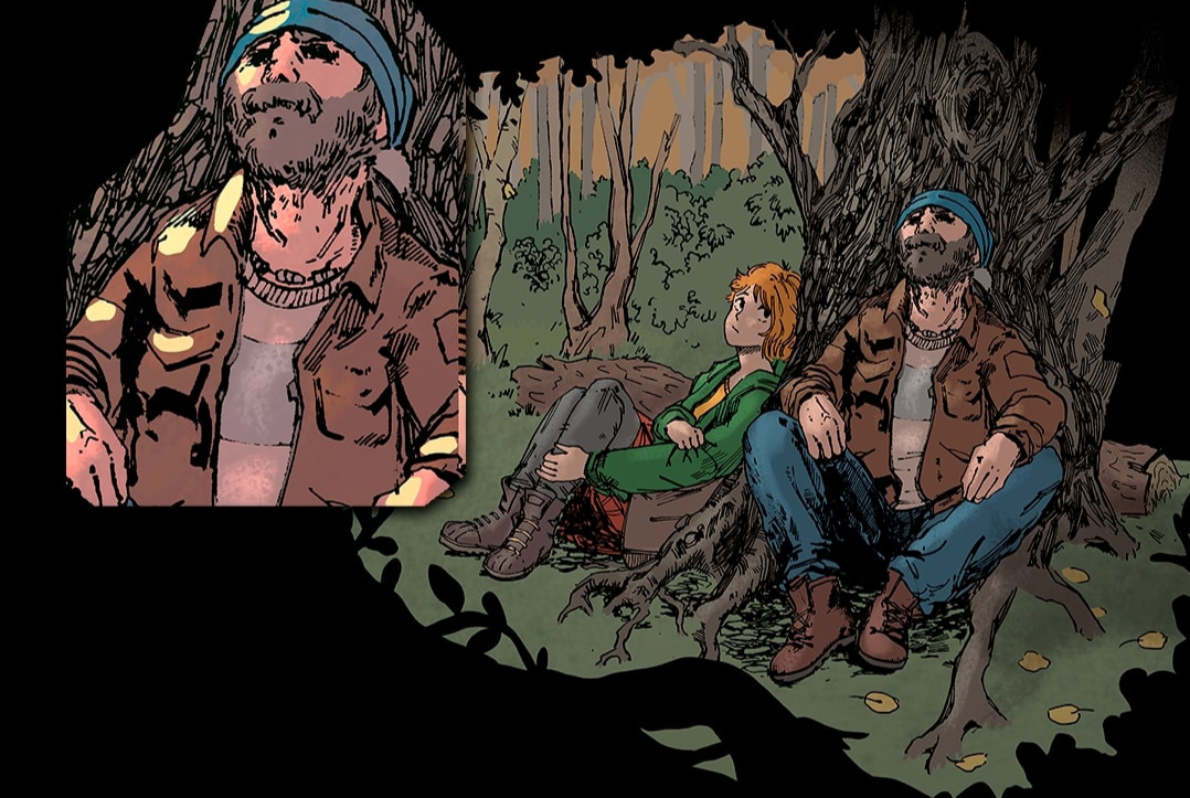
8. Subsurface scattering
Think of how your fingers glow red when covering a flashlight – the same principle applies, when sunlight penetrates your skin and bounces back.
I trace the edges of the shadows and semi-translucent areas (like ears or nose tips) with a soft red brush. The layer is set to “Overlay” at about 45% opacity. While it is subtle, it adds warmth and life to your character.
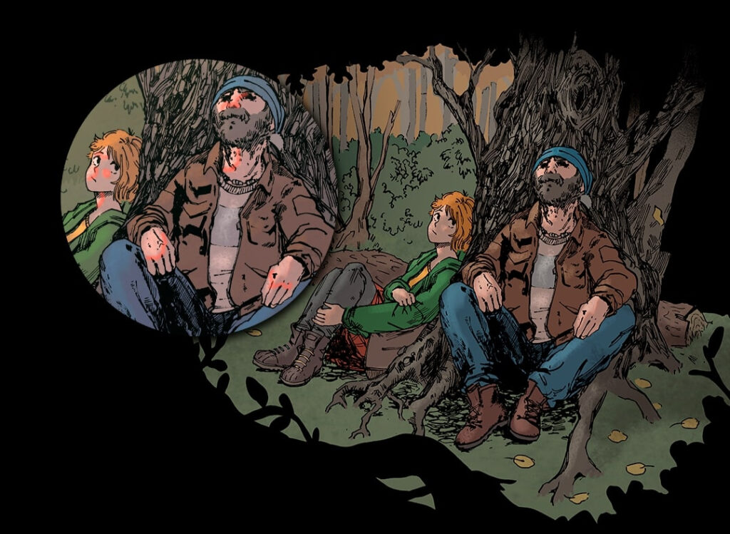
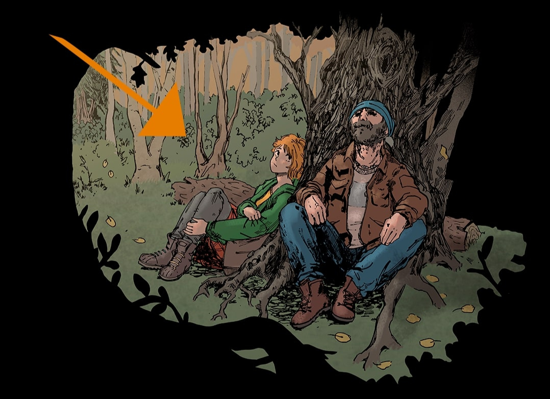
9. Drawing light sources
I use gradients to add light flares and tints on new layers directly above the original inks layer.
10. Creating depth
To create depth, I adjust the brightness of the inks depending on how far the object is in the background. I select the lines I want to brighten with the Lasso tool and tweak “Hue/Saturation”. This can really improve the clarity of the panel. I also color the lines to blend them more into their surroundings.
11. Adding textures
Finally, I overlay a subtle texture across the panel on a “Multiply” layer with 25% opacity to tie everything together .
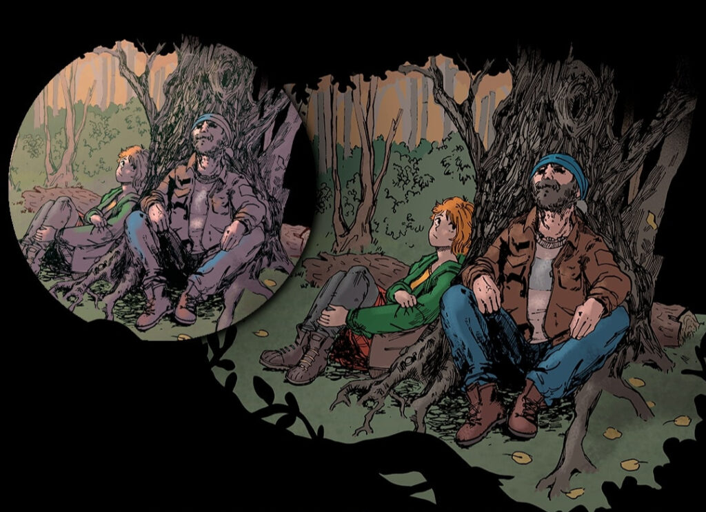
12. Checking color values
Until now, I haven’t worried too much about color value and contrast.
A quick way to check readability of your panel is to view it in grayscale (put a black layer above it set to “Color”) — if it works in black and white, it’ll work in color too.
In print, saturated or dark colors can cause trouble. I aim for a black (K) value under 45% to avoid colors looking dull when printed — I check this using the “Color Picker”.
To check saturation, I activate the “Gamut Warning”. Anything too vibrant for CMYK will turn gray — a sign that printers won’t be able to reproduce these colors properly.
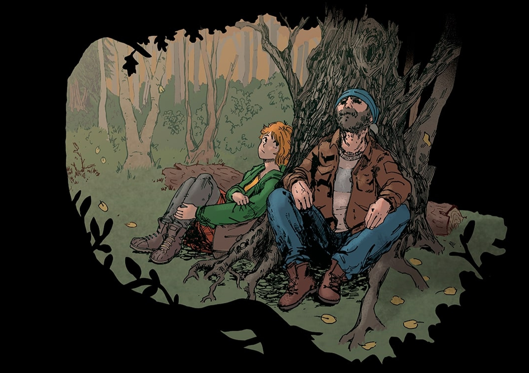
Once satisfied, I convert the panel into a “Smart Object” and apply the finishing touches.
13. Adjust levels
I adjust “Levels” to boost monochromatic contrast. It gives the panel a much clearer appearance.
14. Tweaking exposure
I tweak exposure slightly — increasing “Exposure” and “Gamma Correction” just a touch brightens dark colors. Often, this resolves the issues with a too high black value.
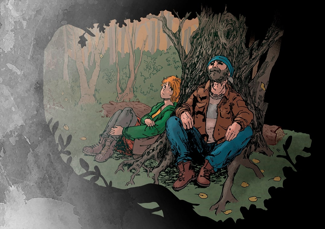
15. Tinting the panel
As a last step, I apply a subtle tint using a “Photo Filter”. In the example panel, the tint is a warm orange-red to simulate late-day sunlight.
It took me a while to get used to working with this many layers — but for a project this big, it really helps me keep a consistent workflow, even when I come back to the comic after not having time to work on it for multiple weeks. It also gives all panels a coherent, polished look.